


Element is a Vue based component library for designers, developers and product managers and has been made in different versions and different languages. Version 2.0 is majorly referred to as Element while version 3.0 is referred to as Element plus.
Element follows design discipline: Consistency, Operation Feedback, Efficiency, ease of Identification, straightforward Interface and controllability. Developer:
github.com/ElemeFE/element Site URL: bit.dev
FrameWork: VueJS Library: Element.io
Purpose of the Integration
The Element Library contains different components:
Basic: Made up of Layout, color, Typography, Icon, Button
Form: Radio, Checkbox, Input Number, Select, Cascader, Switch, Slider, Time Picker, Date Picker, DateTime Picker, Upload, Rate, ColorPicker, Transfer, Form.
Date: Table, Tag, progress, Tree, Pagination, Badge
Notice: Alert, Loading, Message, Message Box, Notification
Nav: NavMenu, Tabs, Breadcrumb, Dropdown, Steps
Other: Dialog, Tooltip, Popover, Card, Carousel, Collapse Bit.dev’s website integrates Element as a core aspect of its site. Element has different Navigations: sidebar Navigation and Top navigation. By hovering on various aspects of the UI, Element is seen to take up a large chunk of it.

Side Navigation: Fix the navigation at the left edge, thus improves its visibility, making it easier to switch between pages. In case, the top area of the page holds commonly used tools eg search bar, help button, notice button, etc. Suitable for background management or utility websites. element.eleme.io/#/en-US

Level 1 Categories: Suitable for simply structured sites with only one level of pages. No breadcrumb is needed.
Level 2 Categories: Sidebar displays up to two levels of navigation. Breadcrumbs are recommended in combination with second level navigation, making it easier for the users to locate and navigate.
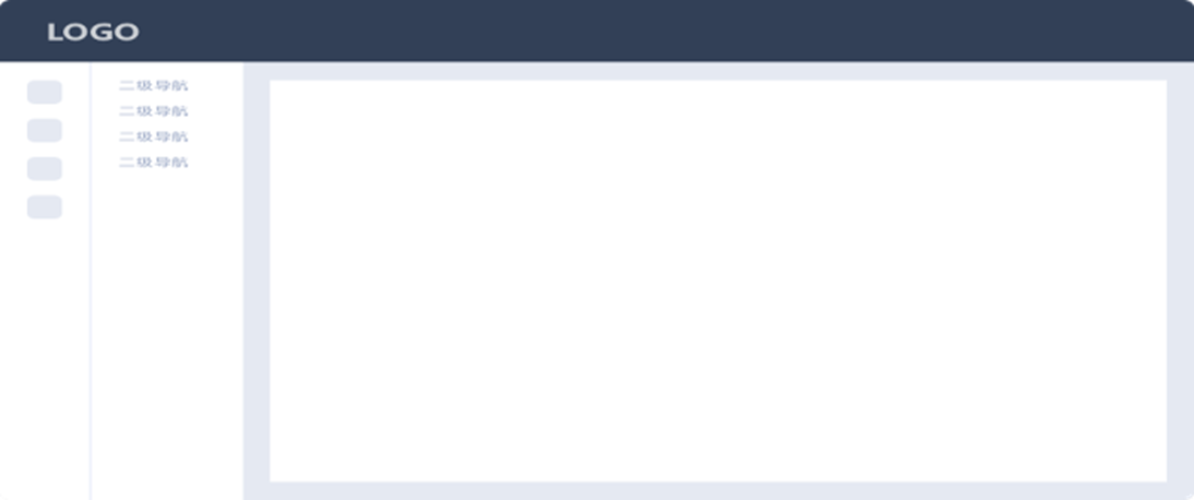
**Level 3 Categories: **Suitable for complicated utility websites. The left sidebar holds first level navigation and the middle column displays second level navigation or other utility options.

Setup Code
npm installation is recommended and it works seamlessly with webpack. npm i element-react –save
npm i element-ui -S To get the CDN, go to unpkg.com/element-ui

Theme: Before the building. You need a style theme, here we recommend you to pick up element-theme-default. npm install element-theme-default –save
Internalization: The default language of Element is Chinese. If you wish to use another language, you will need to do some configuration in your entry file, Built-in-transition: You can use Element’s built-in transition directly.
Fig 2.7 Compatibility The library is compatible with a lot of browsers especially modern browsers however differing in compatibility. It also extends across ensuring that it can be used with fewer limitations.

caniuse.com/?search=element.io Fig 2.8 Any deficiencies with the development approach No deficiencies have been recorded or observed so far. The Element library has proven
My Twitter Handle: https://twitter.com/mchelleOkonicha
My LinkedIn Handle: https://www.linkedin.com/in/buchi-michelle-okonicha-0a3b2b194/
