

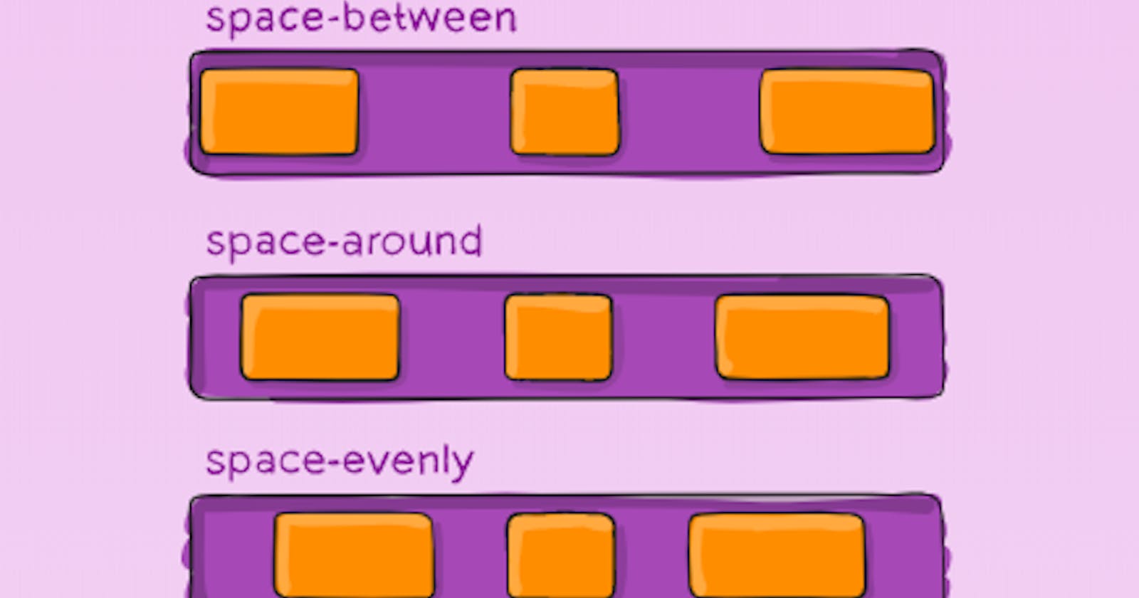


Flexbox is used to build amazing layouts for your application without adding frameworks. With flexbox, responsiveness can be done in minutes and general alignment can be done quickly.
First, you need to understand the layout of your application. Use display: flex, flex: 1, gap instead of padding-left or padding-right. Also use margin: auto more as it saves you the stress of adjusting.
Css is so wide that almost every style can be substituted with another.
My Twitter Handle: https://twitter.com/mchelleOkonicha
My LinkedIn Handle: https://www.linkedin.com/in/buchi-michelle-okonicha-0a3b2b194/